Add Deceased Loved One to Photo: AI Prompt Examples
If you’re searching for “add deceased loved one to photo AI prompt”, you’re probably trying to do something very specific: create a combined photo that feels natural, respectful, and believable—without turning it into a stylized “AI look.”
Prompts can help a lot, but only if you treat them like small steering instructions, not a long creative brief. The more “art direction” you add (cinematic, dramatic, glow, perfect skin), the more likely the result will look artificial.
If you want the full step-by-step workflow first, start here: How to Add a Deceased Loved One to a Photo. This page focuses on prompt wording you can copy and reuse.
Example (Before / After)
Below is a simple example of what we mean by “natural”:
Before (original family photo — loved one not included):
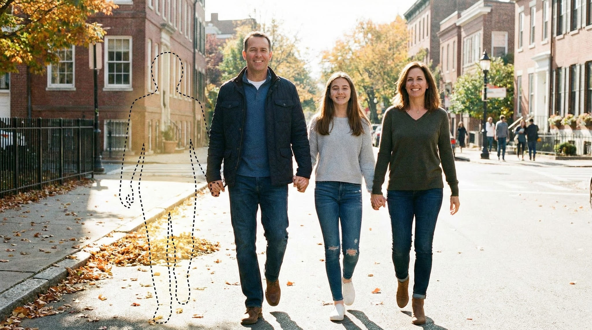
After (loved one added into the family photo):

When you compare the two, the goal is not “perfect,” but believable:
- Similar lighting direction
- Natural edge blending (especially hair and shoulders)
- Consistent sharpness/grain with the base photo
What makes a good AI prompt for memorial photo edits?
A good prompt does four things:
-
Preserves the original photo
- Keep background, color grading, and overall style unchanged.
-
Matches realism signals
- Lighting direction, shadow softness, grain/noise, and sharpness.
-
Specifies placement clearly (only if needed)
- Left/right, behind/in front, seated/standing, approximate distance.
-
Avoids stylization
- No cinematic lighting, no beauty filters, no “make it perfect.”
A prompt that is short, concrete, and realism-first usually wins.
When prompts help (and when they don’t)
Prompts help most when you need to:
- Place the person in a specific spot (left/right/behind someone)
- Match clothing to the occasion (subtle realism)
- Correct small issues (edges, grain, color temperature, shadows)
Prompts usually hurt when you:
- Ask for “beautiful, cinematic, magical, dreamy” vibes
- Add strong style keywords (oil painting, illustration, anime, HDR)
- Request big transformations (age changes, dramatic makeup, fantasy lighting)
Rule of thumb: for memorial edits, ask for less, not more.
The simplest prompt formula (copy/paste)
Use this base prompt for most cases. Only add extra lines when you have a specific problem to fix.
Prompt Template
Add the person from the second photo into the first photo in a natural, realistic way. Match lighting direction, color temperature, sharpness, and grain. Keep the background and overall style unchanged. Blend edges realistically, especially around hair, shoulders, and hands. No filters, no stylization, no dramatic lighting.
If your tool supports negative prompts, use this:
Negative Prompt
cartoon, illustration, painting, anime, cinematic, glow, HDR, beauty filter, airbrushed, overly smooth skin, unrealistic shadows, artifacts, blurry face, extra fingers, distorted hands, halos
Tip: If your result looks “cut out,” the fix is usually grain matching + softer edge blending, not more creative prompting.
Prompt building blocks (mix-and-match)
Instead of writing one long prompt, use this approach:
- Start with the base prompt
- Add ONE “block” for your main issue
- Re-run
- Only add a second block if needed
Block A: Placement
Place the person on the left/right side of the group, slightly behind the front row. Keep natural perspective and scale.
Block B: Realism (grain + sharpness)
Match grain/noise and sharpness to the original photo. Avoid over-sharpening and avoid smoothing skin.
Block C: Color temperature
Match color temperature and skin tone to the original photo. Avoid orange or green casts.
Block D: Shadows
Add subtle, realistic shadows consistent with the existing light direction. No harsh shadows.
Block E: Edge blending
Blend edges naturally around hair and clothing. Avoid halos or hard outlines.
12 AI prompt examples (realistic & respectful)
Below are copy-ready prompts. Replace “photo 1” and “photo 2” mentally with your base photo and the loved one’s photo.
1) Natural memorial edit (default)
Add the person from photo 2 into photo 1 naturally and realistically. Keep the original photo’s style unchanged. Match lighting direction, color tone, and grain. Blend edges around hair and shoulders. No filters or stylization.
2) Specific placement: left side, slightly behind
Add the person from photo 2 into photo 1 standing on the left side of the group, slightly behind the front row. Match perspective and height relative to others. Keep lighting and color consistent. No stylized effects.
3) Tight composition: between two people
Insert the person from photo 2 between the two people in the center of photo 1. Adjust scale so the head size matches nearby faces. Blend edges naturally around shoulders and hair. Keep the background unchanged.
4) Seated placement (more difficult)
Add the person from photo 2 seated next to the person on the right in photo 1. Match sitting height, body angle, and lighting direction. Keep original texture and color grading unchanged. No filters.
5) Match clothing subtly (avoid “wardrobe redesign”)
Add the person from photo 2 into photo 1. Clothing should look appropriate for the setting and realistic (no dramatic fashion). Keep the original photo style unchanged. No filters.
6) Warm indoor lighting (avoid plastic skin)
Add the person from photo 2 into photo 1 under warm indoor lighting. Match light direction and softness. Keep natural skin texture and avoid smoothing. Blend edges carefully.
7) Outdoor daylight (avoid studio look)
Insert the person from photo 2 into photo 1 under natural daylight. Keep shadows soft and consistent with the scene. Do not add studio lighting or cinematic effects.
8) Fix the “cutout sticker” look
Add the person from photo 2 into photo 1 and blend edges so it doesn’t look cut out. Match grain/noise, sharpness, and contrast to the original photo. Pay attention to hair edges and clothing outline.
9) Fix scale and perspective (most common realism issue)
Add the person from photo 2 into photo 1 with correct perspective and scale. Make head size and shoulder width consistent with nearby people at the same depth. Keep the original background unchanged.
10) Preserve the original photo (minimal change approach)
Add the person from photo 2 into photo 1 with minimal changes. Keep the original photo’s background, colors, and style unchanged. Focus only on natural placement, lighting match, and edge blending.
11) Improve face detail without overdoing it
Add the person from photo 2 into photo 1 naturally. Preserve facial detail and avoid artifacts. Match grain and sharpness to the base photo. Avoid smoothing or beauty filtering.
12) Printable output (export-friendly)
Create a natural, realistic combined photo suitable for printing. Keep the original style unchanged. Avoid artifacts and preserve face details. Match grain, sharpness, and color tone. No filters.
Mini prompt add-ons (use only if needed)
Append ONE line when you have a specific problem.
For sharpness mismatch
Match sharpness and grain to the original photo. Do not over-sharpen.
For color mismatch
Match color temperature and skin tone to the original photo. Avoid orange/green casts.
For shadow mismatch
Add subtle, realistic shadows consistent with the existing light direction. No harsh shadows.
For depth / behind someone
Place the person slightly behind the foreground subject and respect occlusion (do not overlap unnaturally).
For edge halos
Remove halos and hard outlines. Blend edges naturally around hair and clothing.
Troubleshooting: quick fixes for common problems
These are the most common “why does it look fake?” issues. Fix them with small prompt changes rather than big stylistic prompts.
Problem: “Cutout sticker” edges
Why it happens: the tool doesn’t match the base photo’s grain/softness, and edges are too sharp.
Fix: add this line:
Match grain/noise and blend edges naturally around hair and shoulders. Avoid halos.
Also consider reducing the size of the subject slightly—oversized subjects look cut out more often.
Problem: Colors don’t match
Why it happens: different lighting temperature between the two photos (warm indoor vs cool daylight).
Fix: add this line:
Match color temperature and skin tone to the original photo. Avoid orange/green casts.
If the base photo is warm (yellow-ish), don’t try to force a cool look. Match the base.
Problem: Person looks too sharp or too smooth
Why it happens: the tool tries to “enhance” the inserted face, making it look like a different camera.
Fix: add this line:
Match sharpness and natural texture to the base photo. Avoid smoothing and beauty filters.
Problem: Scale looks wrong
Why it happens: head size is the biggest giveaway. Even a small mismatch looks unnatural.
Fix: add this line:
Make head size consistent with nearby faces at the same depth. Match perspective.
A simple test: compare eye-line height and shoulder width with someone standing next to the intended spot.
Problem: Lighting direction doesn’t match
Why it happens: the inserted person has light from the opposite side, creating “wrong-side shadows.”
Fix: add this line:
Match lighting direction and shadow softness to the base photo. Add subtle realistic shadows only.
Avoid asking for “dramatic” shadows—memorial edits look best with subtlety.
Common prompt mistakes (that make it look fake)
Avoid these phrases (they often trigger stylization):
- cinematic, dramatic lighting, glow, dreamy, magical
- oil painting, illustration, anime, cartoon
- perfect skin, flawless, airbrushed
- HDR, 8K ultra sharp (often causes weird edges and halos)
If your result looks “AI-ish,” the fix is usually:
- Remove style words
- Re-run with realism + edge blending + grain matching
- Reduce edits to only what’s necessary
Quick realism checklist (before you export)
Use this checklist before you download/print:
- Head size matches people nearby
- Eye line and shoulder width look consistent
- Lighting direction matches the scene
- Edges look natural around hair/shoulders/hands
- Grain/sharpness matches the base photo
- No extra fingers / warped hands
- No weird halos around the subject
FAQ
Do I need prompts at all?
Not always. If your tool places the subject well automatically, prompts should be minimal. Over-prompting often makes results worse.
What’s the best “negative prompt” for memorial photo edits?
Start with: cartoon, illustration, anime, cinematic, glow, HDR, beauty filter, airbrushed, overly smooth skin, extra fingers, halos.
Negative prompts are mainly for removing stylized looks and obvious artifacts.
Why does it look like a cutout even when the face looks good?
Cutout look usually comes from edge sharpness + mismatched grain. Add “match grain/noise” and “blend edges around hair and shoulders,” and avoid over-sharpening.
Can prompts fix low-quality or blurry photos?
Only a little. Prompts can’t fully replace missing detail. You’ll get the best results from a clear face, similar angle, and decent resolution.
Is it okay to make it “more beautiful” or “cinematic”?
For memorial edits, those words often make the result look less real. If you want something gentle, use “natural, realistic, minimal changes” instead.
Related guides
- How to Add a Deceased Loved One to a Photo
- Add Deceased Loved One to Photo (Free)
- Add Deceased Loved One to Photo App
- Add Loved One to Photo
Next step (optional)
If you want the simplest workflow first, open Add Loved One to Photo, upload two photos, and start with the base template prompt above. Keep edits minimal, focus on realism, then export a high-quality download you can print and keep.