Add a Deceased Loved One to a Photo
A respectful, realism-first approach to completing a memory — without loud effects or uncomfortable comparisons.
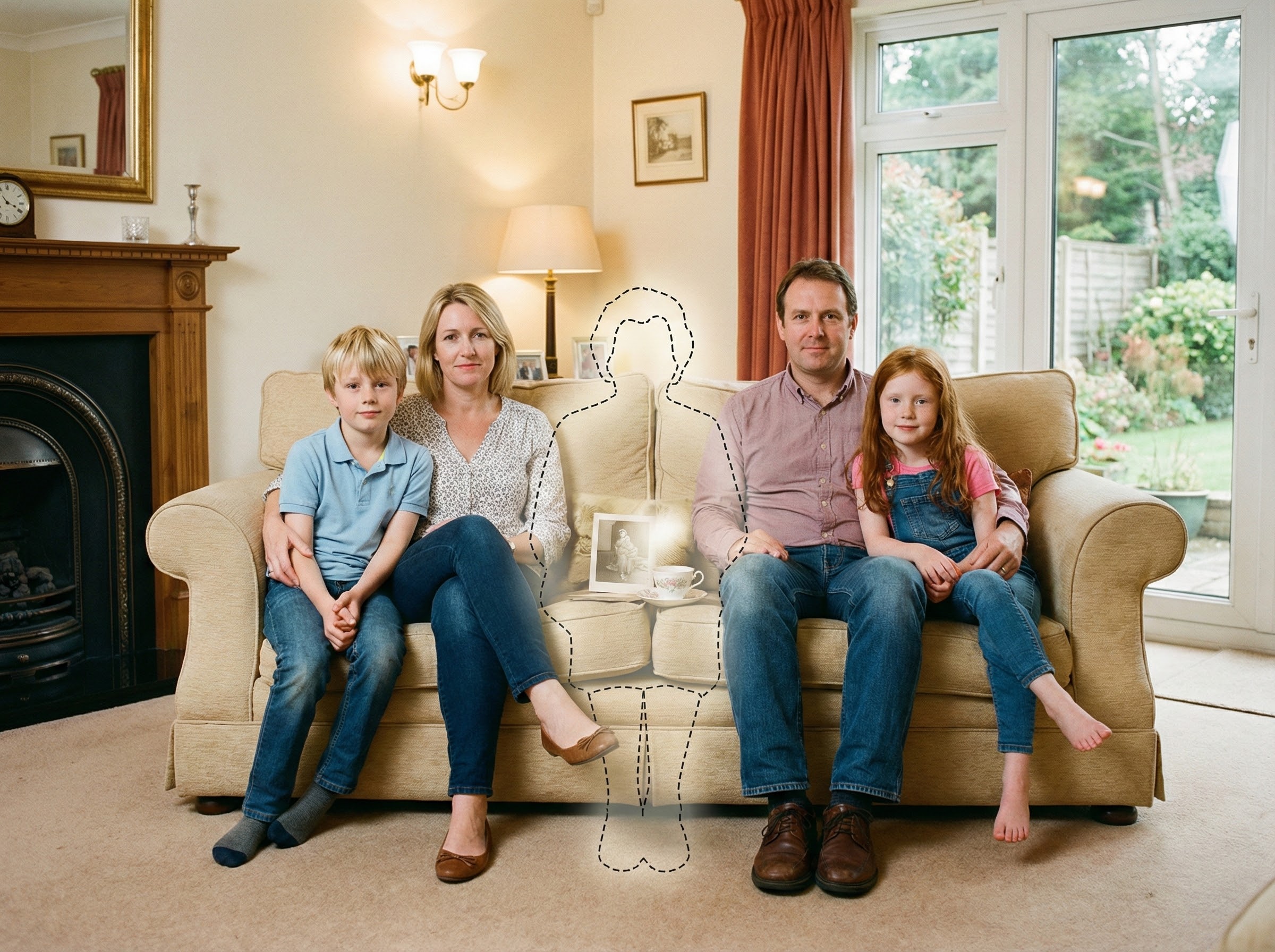
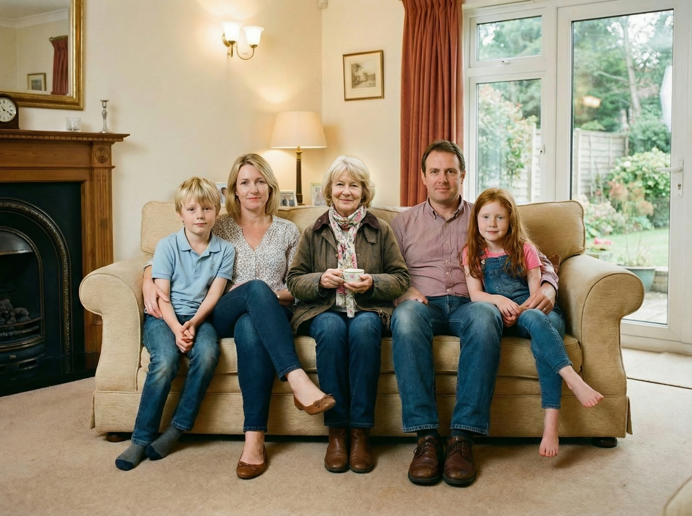
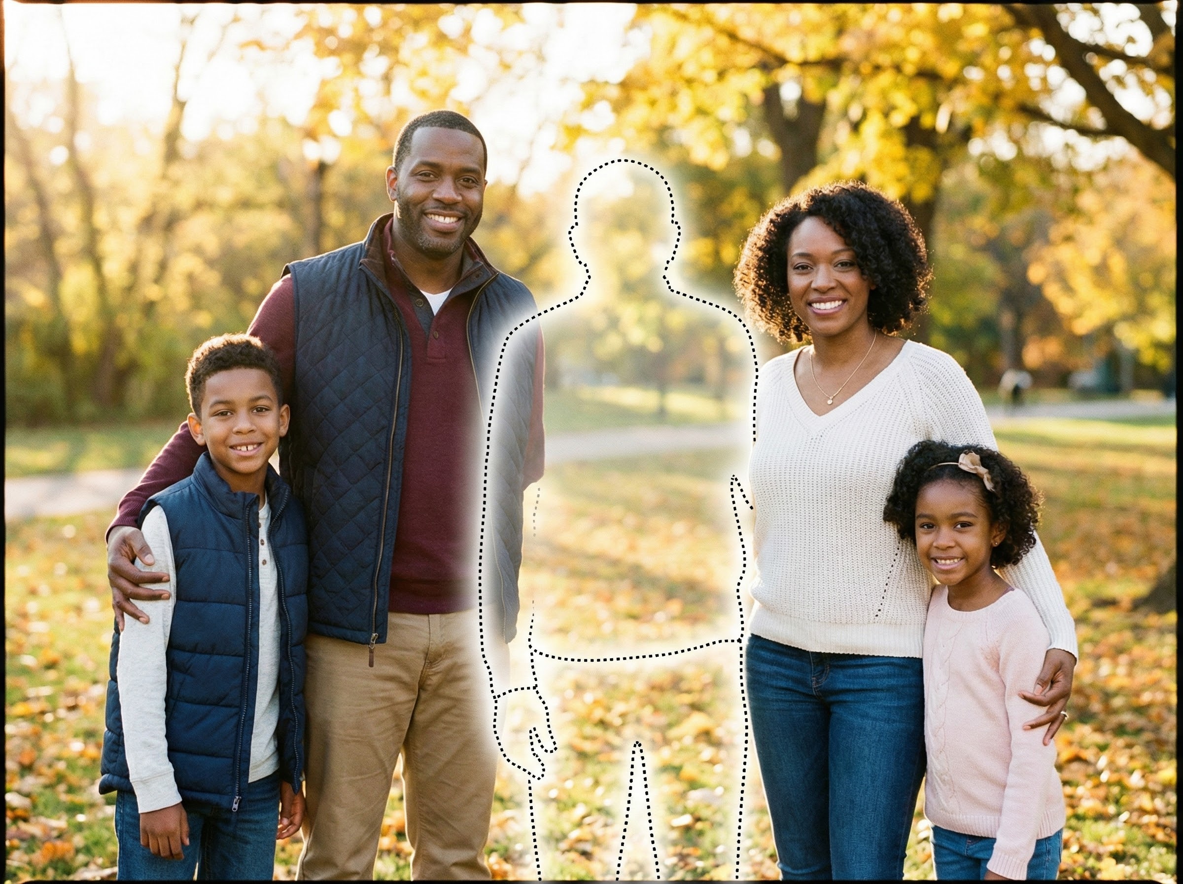
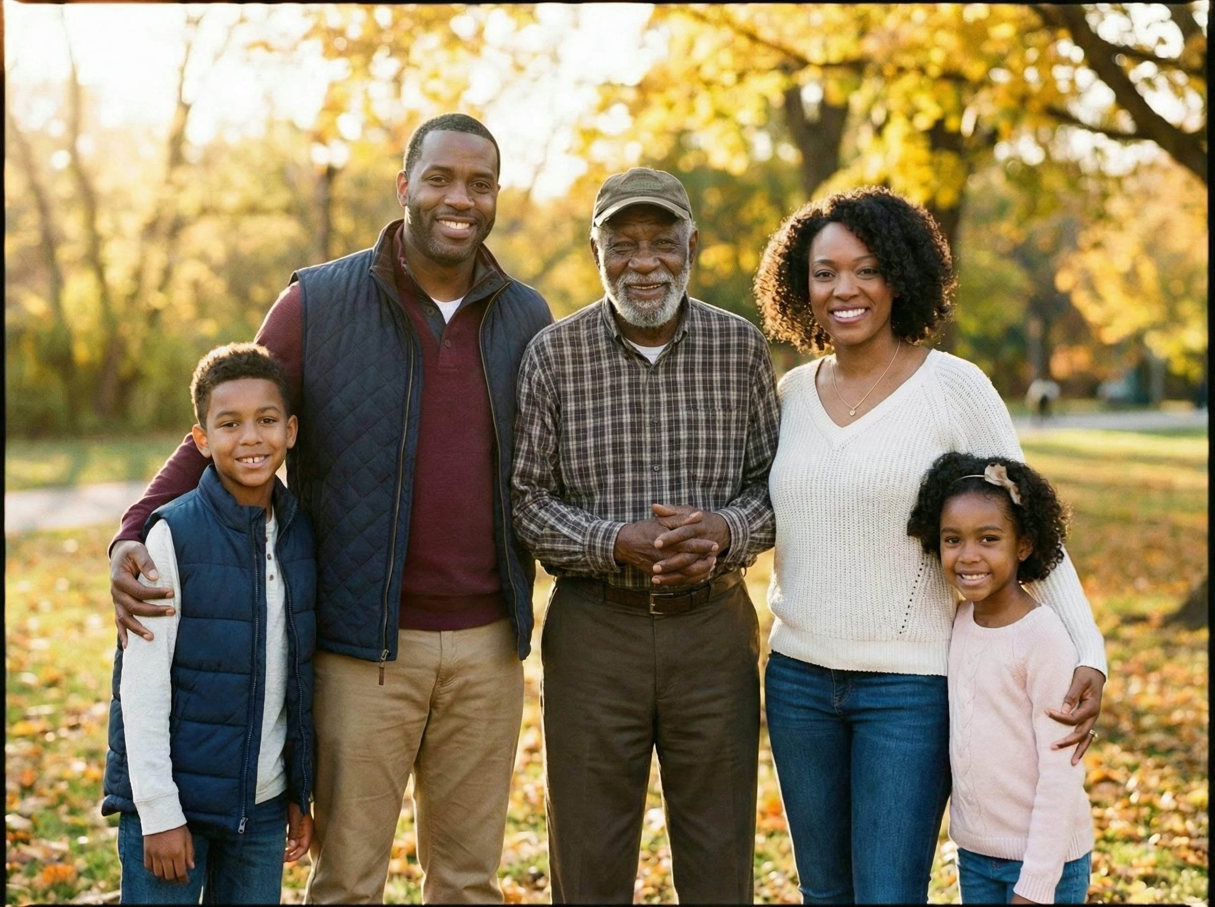
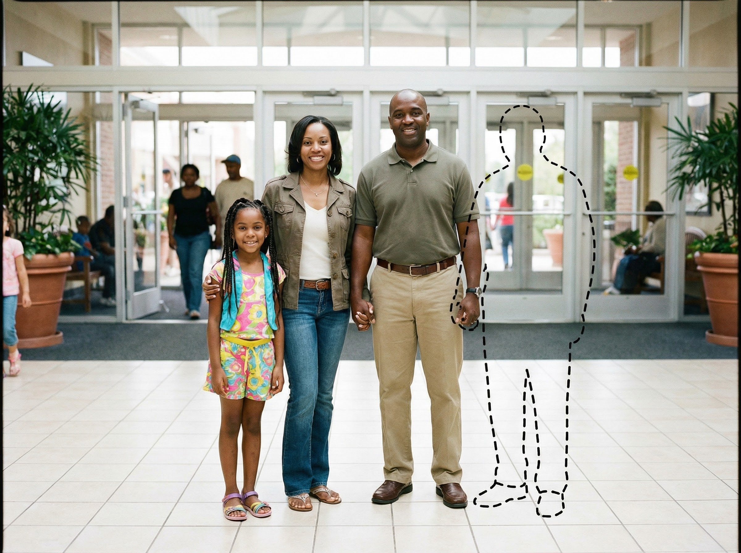
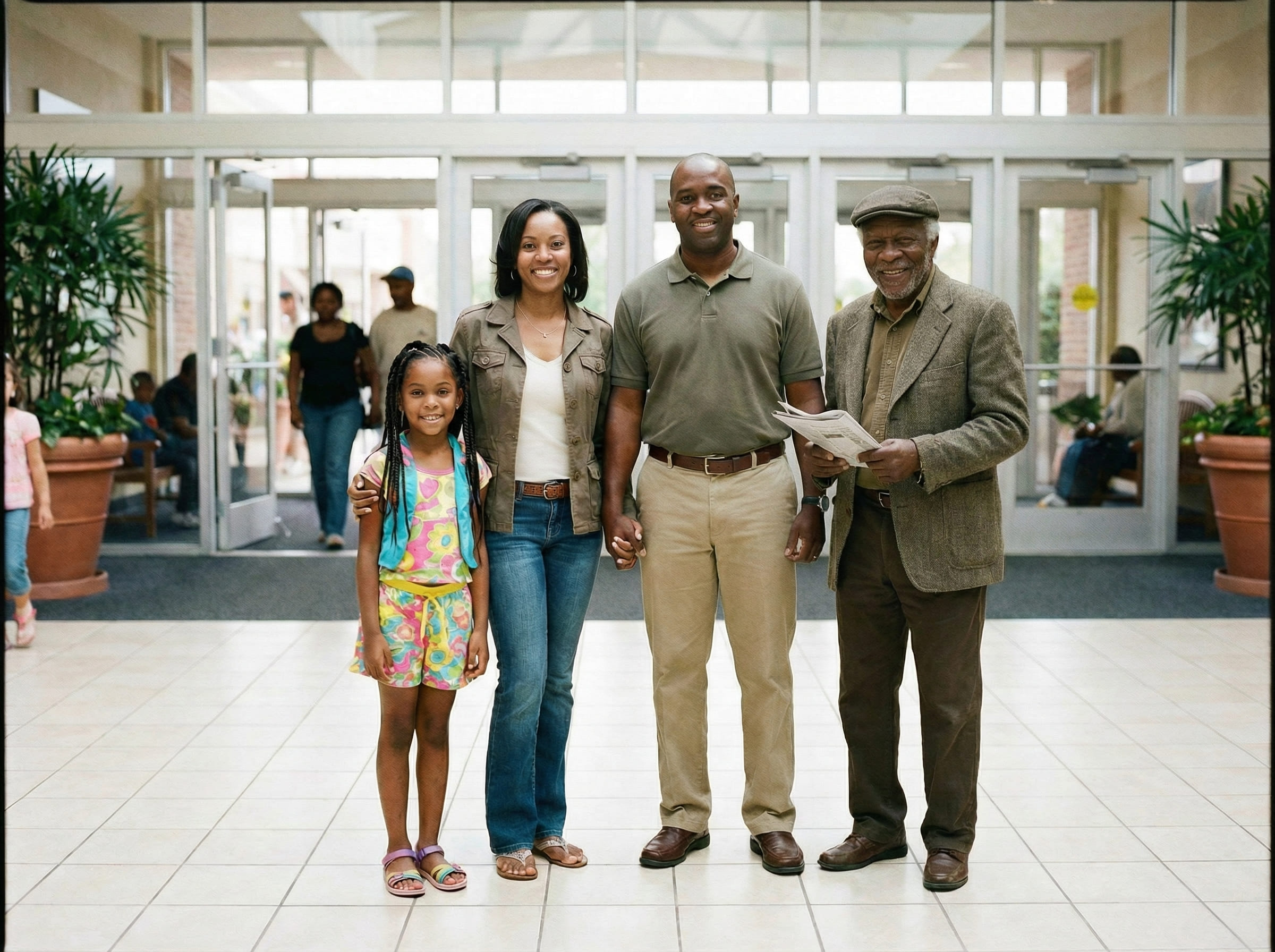
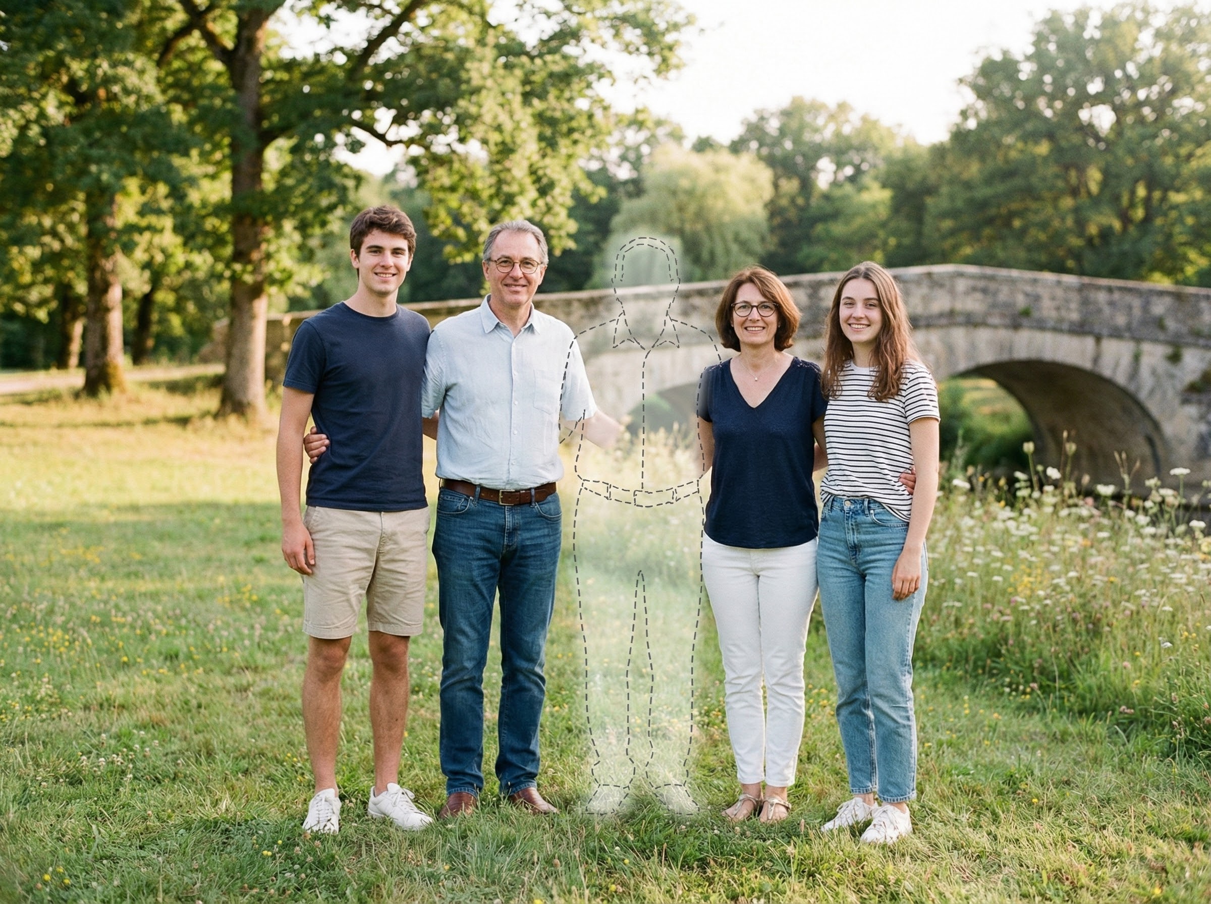
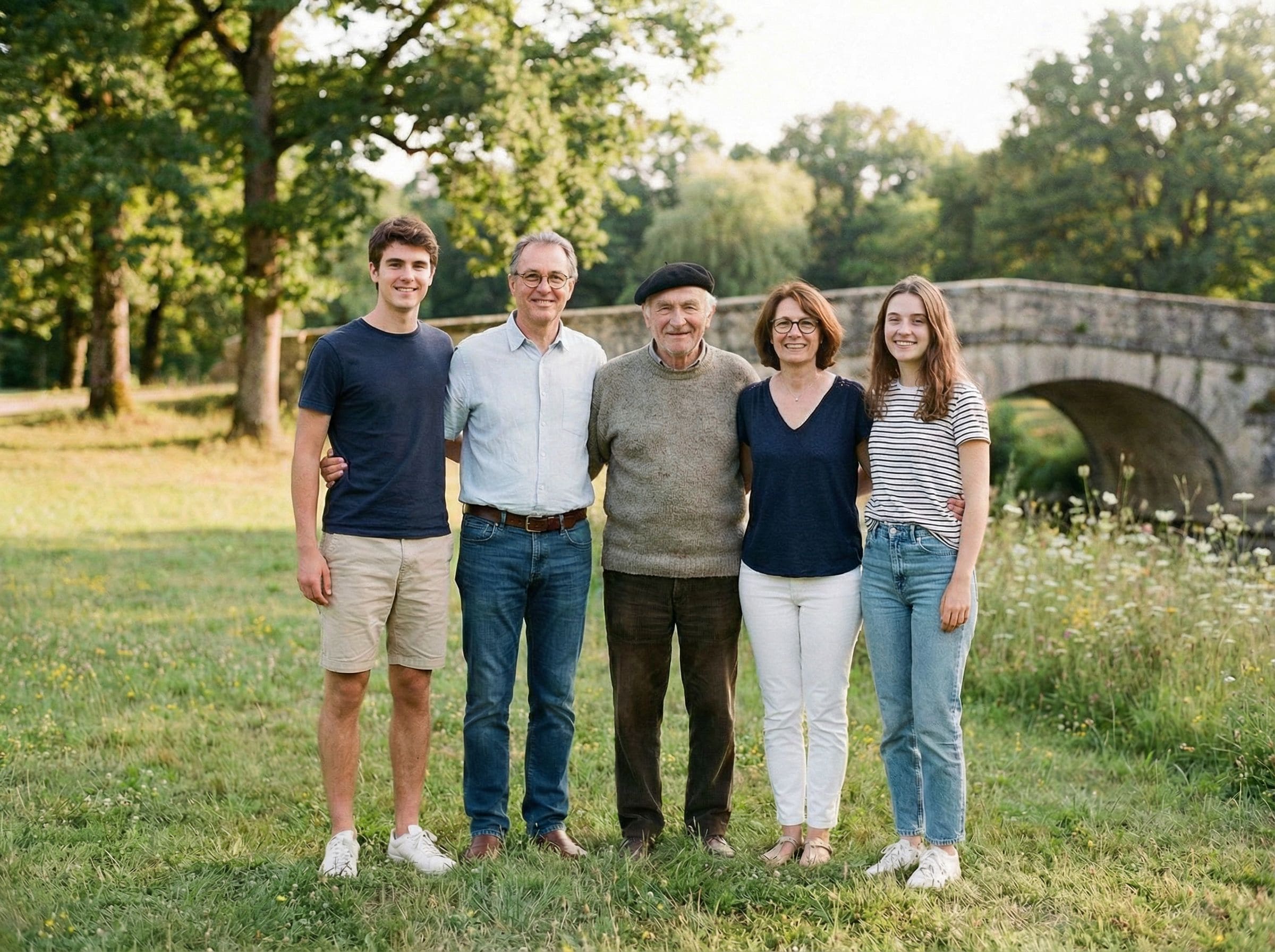
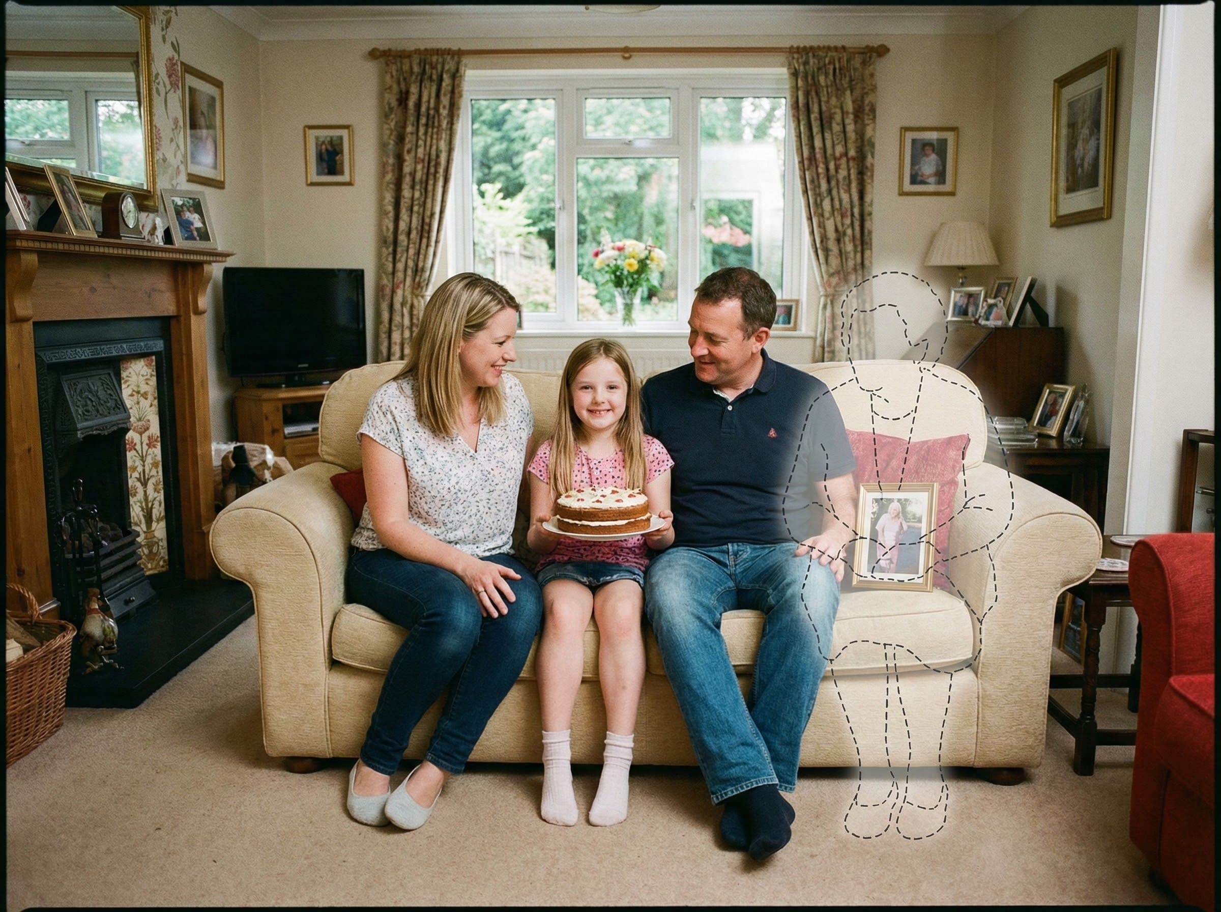
When a picture doesn’t reflect how the moment truly felt, you can add them back in a way that stays faithful to the original scene.
Examples
Quick checklist
Small details matter more than complicated steps.
- Main photo: original file (avoid screenshots), minimal filters
- Loved one photo: face clear, natural light if possible
- Choose a spot where a person could realistically stand or sit
A quiet way to complete a meaningful memory
There are photos people revisit for years — the ones that live in albums, frames, and family messages. They aren’t just images; they become the way a moment is remembered.
When someone has passed away, a photo from an important day can feel incomplete in a very specific way. Not because it’s “wrong,” but because it doesn’t match the emotional reality of the memory.
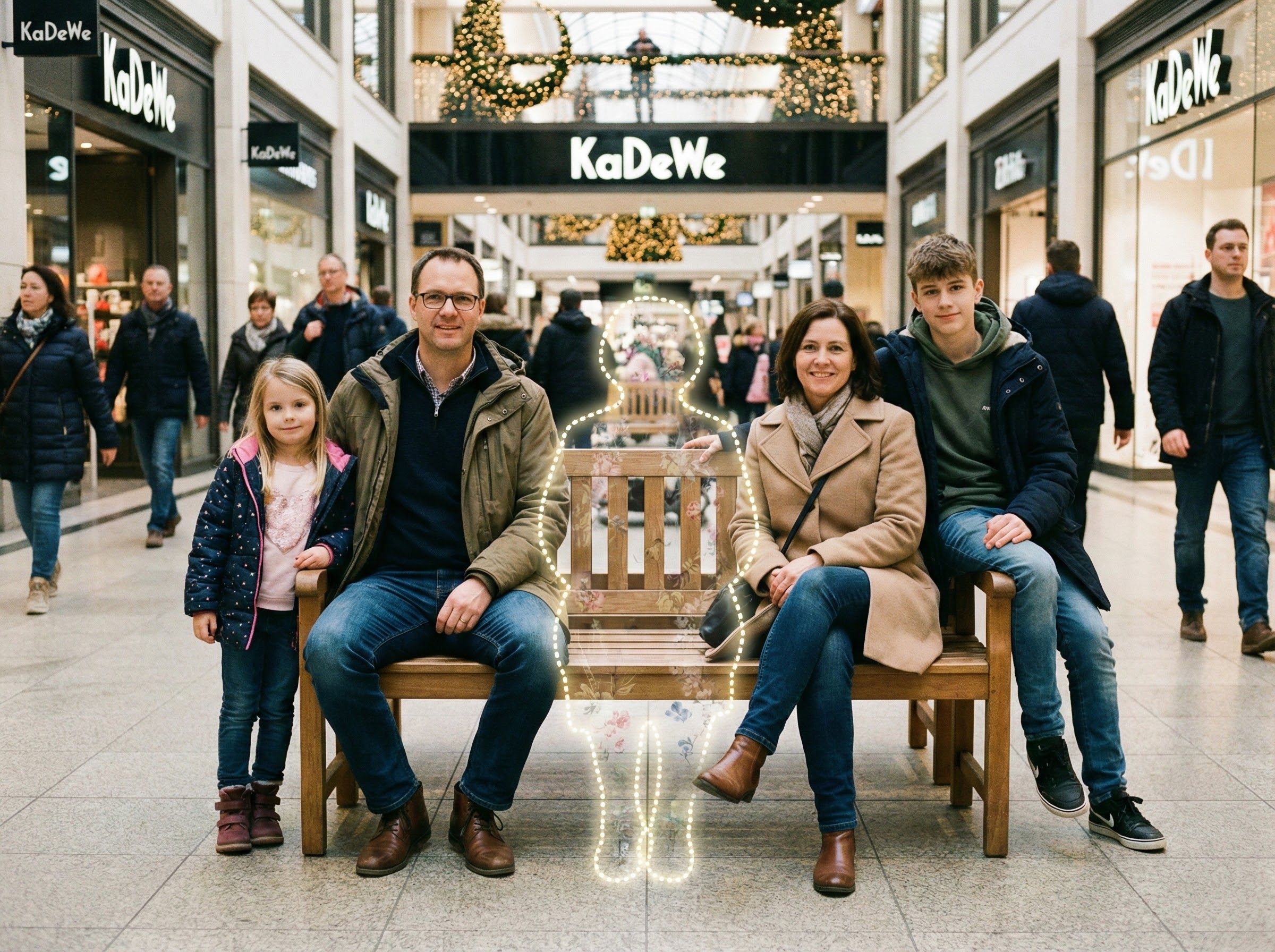
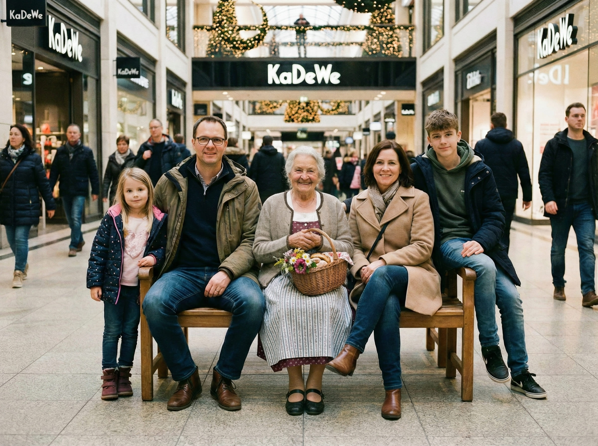
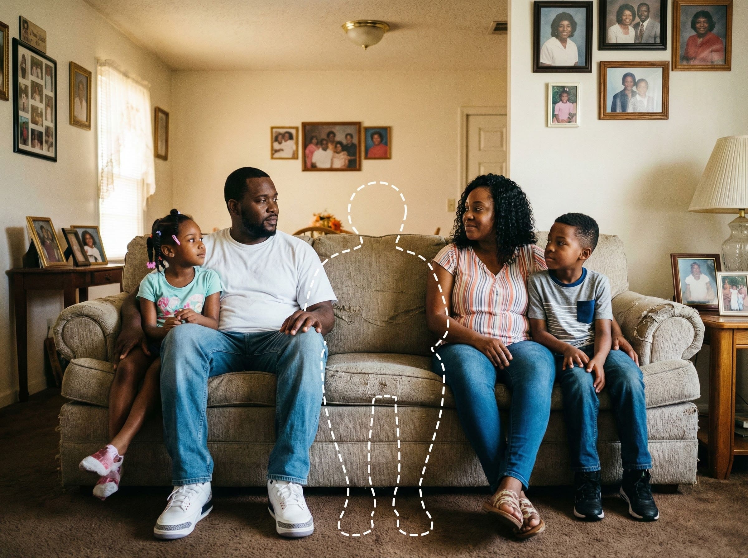
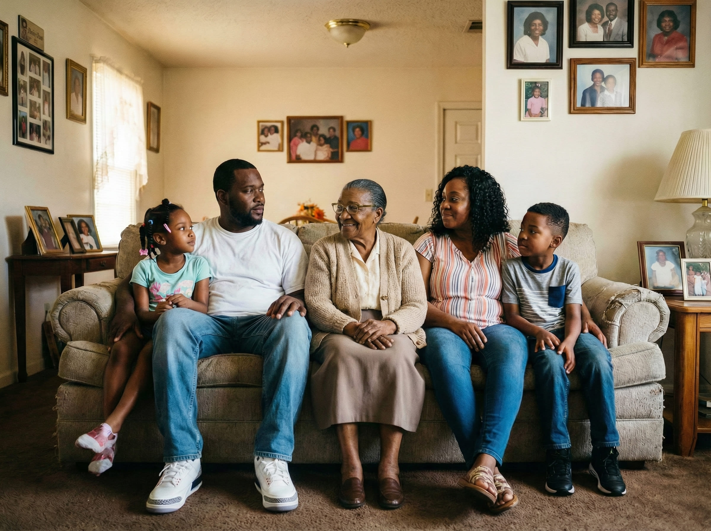
That’s why people look for Add Loved One to Photo Who Passed Away solutions. The goal isn’t to create a new story. The goal is to complete the scene carefully — keeping the same background, the same mood, and the same camera perspective — so the finished photo feels like it always belonged there.
Some people do this for a wedding where a parent couldn’t attend, a family gathering that feels missing someone, or a milestone photo that they want to print without that sense of absence.
It’s also common to feel uncertain before you begin. A respectful result often comes from going slowly: choose clearer inputs, try one simple placement first, and stop when it feels appropriate to you.
If you plan to print the image, subtle realism matters even more — print makes small inconsistencies easier to notice. That’s why the steps below focus on distance, lighting direction, and believable placement.
How people create a complete photo
The simplest workflow usually produces the most believable result. To Add a Loved One Who Passed Away to a Photo, you’re essentially matching one person into one scene without changing what the scene already is.
Most people run 2–3 attempts. Not because the tool is complicated — but because the best placement is often subtle. Moving someone slightly back, aligning shoulder height, or matching the distance to nearby people can change everything.
If you’re unsure where to place them, pick a position that obeys the scene’s logic: standing if everyone is standing, seated if the photo is seated, and never floating in an area that has no natural space.
What makes the result look natural
People often think realism is mostly about faces. In practice, realism is mostly about the scene.
When you Add Loved One to Photo Who Passed Away and want it to look natural, these are the biggest drivers:
If the finished image feels “separate,” try this order: adjust distance first, then lighting direction, then edge realism. Distance fixes the most issues fastest.
Understanding realistic expectations
It helps to set expectations before you begin. A respectful keepsake doesn’t need to look “perfect” — it needs to look consistent with the moment.
Best case: both photos are clear and taken in similar conditions (indoor vs indoor, outdoor vs outdoor), with comparable lighting softness.
Normal case: you may need a couple of tries. Small changes in placement often produce large changes in realism.
Hard case: extreme differences in quality (very grainy vs very sharp), opposite lighting (flash vs daylight), or very different camera angles can reduce believability.
In those hard cases, switching to a different loved one photo usually helps more than forcing the placement to work.
Tips for the best result
These tips improve realism quickly when you want to Add a Loved One Who Passed Away to a Photo:
If you’re planning to frame the photo, generate at the highest quality available and keep the final file uncompressed. Print tends to reveal small lighting and edge issues that are easy to miss on a phone screen.
Common ways people use this
People use this for moments that will be kept — not scrolled past. Common scenarios include:
- Wedding photos where a parent or close family member couldn’t be there
- Family portraits meant to represent everyone
- Holiday gatherings (Christmas, Thanksgiving) for albums
- Graduations and milestones for keepsakes
- A framed photo for home or a remembrance table
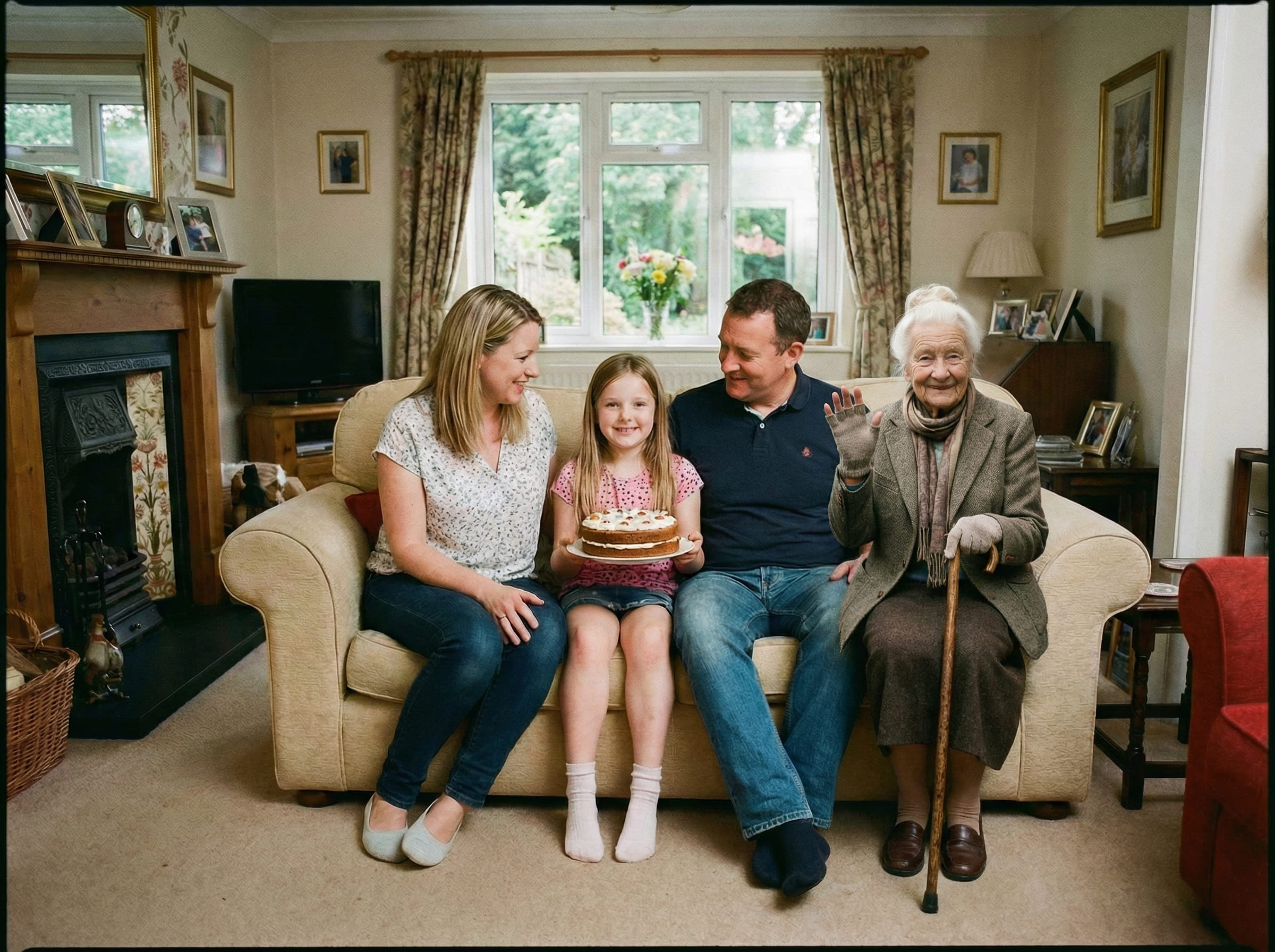
If you want a result that feels respectful, choose the version that looks like a real photo someone could have taken that day.
Is this right for you?
This is a good fit if your priority is realism and emotional comfort — a result that doesn’t feel like an “edit.”
- Want a calm, believable result for a keepsake
- Prefer subtle completion over dramatic transformation
- Want control over placement and retries
- Plan to print the final image
- Care about matching the original moment
- You want artistic or stylized “edited” looks
- Your photos are heavily filtered or extremely low quality
- You need a flawless match in one attempt
- You want a highly dramatized effect
Choosing the right approach helps keep expectations aligned.
If you’re uncertain, start with the clearest two photos you have and run one simple placement. You can always refine or pause — nothing is final unless it feels right to you.
Frequently asked questions
Start when you feel ready
Upload your main photo and a clear photo of your loved one. Choose a realistic placement, then download a printable PNG/PDF for albums and frames.