How to Add a Deceased Loved One to a Photo

A step-by-step, realism-first guide to completing a meaningful photo — keeping the same scene, the same light, and the same moment.

If you want a result that feels respectful and believable, the process is mostly about scene consistency: depth first, then light direction, then edges.

Try It NowStart with photo selectionStep-by-step workflow · Placement control · Printable PNG/PDF
Scene-first realism
Depth + light direction guide every step
You stay in control
Placement choices + retries until it feels right
Respectful outcome
No loud effects or uncomfortable comparisons
Print-ready
High-quality PNG/PDF for albums & frames

Examples

Original scene used to explain camera angle, lighting direction, and available space before placing a loved one back into the same moment
Original scene — what to preserveContext
Completed scene showing the loved one added with consistent lighting, believable depth, and calm placement so the photo feels like one moment
Completed — calm and believableCompletion

Quick checklist

A believable result comes from simple, consistent inputs.

  • Main photo: original file (avoid screenshots), minimal filters
  • Loved one photo: face visible, soft light when possible
  • Choose placement that matches the scene (standing vs seated)
Tip: The most respectful result usually looks “ordinary” — like one camera captured one scene at one moment.

Before you start: what “realistic” means

When people ask how to add a deceased loved one to a photo, they often imagine the work is mostly about the face. In reality, realism is mostly about the scene.

A respectful completion should preserve the original moment: the same background, the same camera distance, the same light direction, and the same feeling of space. The goal is not to create a new story — it’s to complete the original scene in a way that doesn’t call attention to itself.

Respect test: If the finished photo doesn’t demand attention and instead feels quietly consistent with the original, you’re doing it right.

With that in mind, the steps below focus on the three things that decide believability fastest: depth, light direction, and edge behavior.

Step 1: Choose the main photo to preserve

Your main photo is the “truth” of the scene. If you want to learn how to add a deceased loved one to a photo in a believable way, start by choosing a main image that gives the scene a clear structure.

Choose the original file
Avoid screenshots or heavily compressed versions. Detail matters for blending and printing.
Prefer simple lighting
Soft indoor light or daylight is easier than harsh flash or mixed lighting.
Look for natural space
A believable spot (standing or seated) makes placement feel like it belonged there.
Keep the camera angle honest
Straightforward angles blend better than extreme tilt, fisheye, or strong perspective distortion.

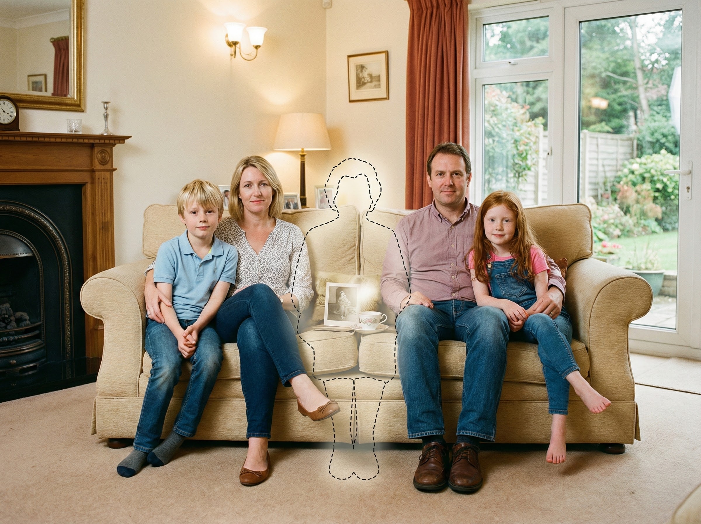
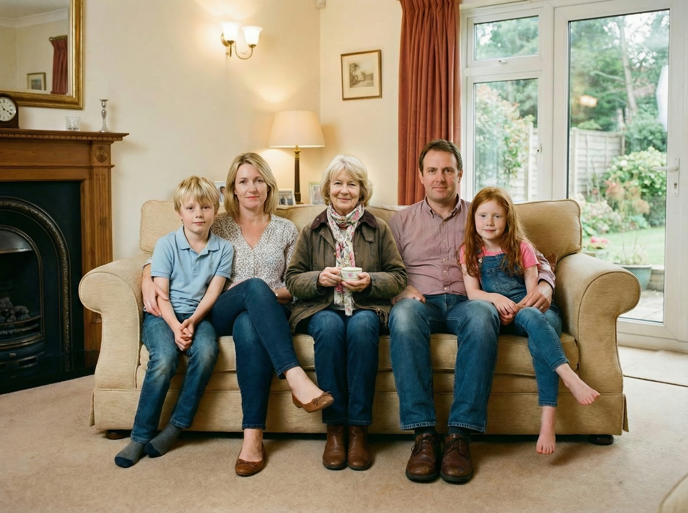
If your main photo is a group shot, identify the “depth line” where people are standing or sitting. Your added person should live on that same depth line.

Step 2: Choose the loved one photo that blends best

This step often matters more than people expect. When learning how to add a deceased loved one to a photo, you’ll get better results by choosing the loved one photo that behaves like the scene — not necessarily the most “favorite” portrait.

Soft, natural light
Soft light creates realistic shadows and edges that integrate more easily.
Face visible, not tiny
A clear face helps, but “clear” matters more than “perfect.”
Similar scene type
Indoor-to-indoor and outdoor-to-outdoor usually blend best.
Avoid heavy filters
Filters change contrast and skin tone, making blending feel separate.
Practical rule: If the loved one photo already looks like it could have been taken on the same day, you’re starting with a huge advantage.

Step 3: Pick placement that obeys scene logic

Placement is where most “collage” results are created — and where most fixes live. A key part of how to add a deceased loved one to a photo is choosing a spot that makes sense in the original environment.

1
Match posture to the scene
If the group is standing, place them standing. If everyone is seated, place them seated.
2
Use a believable “space”
Choose an area where a person could physically fit without blocking important elements unnaturally.
3
Start subtle
A calm placement often looks more respectful and more realistic than a centered “feature” position.
Placement shortcut: Pick the nearest person in the main photo and match your loved one’s depth to that person first. If that relationship looks right, the whole scene usually looks right.

Step 4: Generate, then refine (2–3 tries)

Most people get the best result after a couple of attempts. That’s normal — and it’s part of how to add a deceased loved one to a photo without forcing it.

Use a simple refinement order:

  • Depth/Distance: move them slightly back if they feel pasted forward
  • Scale: align shoulder height and body proportions to nearby people
  • Lighting: ensure the subject’s light direction matches the scene
  • Edges: aim for softer, camera-like edges (especially hair/shoulders)

Stop when it feels right. A respectful keepsake doesn’t need to be “perfect” — it needs to be consistent with the moment.

What makes it look natural

If you remember only one thing about how to add a deceased loved one to a photo, remember this: realism is scene consistency.

Depth & distance
Match the camera distance of the group so the person doesn’t look pasted forward.
Light direction
Left-lit scenes need left-lit subjects; shadow softness should match the environment.
Natural overlap
Small overlaps and imperfect spacing often look more real than perfect separation.
Edge behavior
Hair/shoulders should have soft transitions, not hard cutout lines.
Dual-image examples (same moment)
These pairs show the same scene. The completed photo keeps the original camera feel and tone.
Original scene showing natural spacing and depth cues that should remain consistent
Original cue — distanceContext
Completed scene showing matched scale and believable depth so it feels like one moment
Completed — scale matchedCompletion
If something looks off, don’t chase tiny details first. Fix depth, then light direction, then edges.

Troubleshooting common issues

Even when you follow the steps, a few common issues can happen. Here’s how to fix them quickly.

It looks like a sticker or cutout
Move the loved one slightly farther back (depth), reduce “center stage” placement, and prefer softer-light source photos.
Lighting feels wrong
Pick a loved one photo with a similar light direction (left/right/top) and similar softness (flash vs natural).
The size feels off
Match shoulder height to the closest person at the same depth line. Scale is believable when relationships match, not when the subject is simply “bigger.”
Edges look too sharp
Choose a loved one photo with softer edges (less sharpening, less compression). Hair and shoulders blend best with natural light.

Tips for print-quality keepsakes

If you’re making a keepsake for an album or frame, printing changes the standard. Small inconsistencies become easier to notice.

Use uncompressed originals
Avoid screenshots and messaging-app copies. Start from camera files or cloud backups when possible.
Generate at highest quality
Higher-quality output holds up better in print and reduces visible artifacts.
Pick the calmest version
The most “enhanced” version often prints worse than the most consistent version.
Keep the final file intact
Avoid re-uploading to social apps before printing; download PNG/PDF and keep it uncompressed.
Print tip: If your main photo is low-resolution, try a higher-quality version of the same shot before generating. Print rewards clean inputs.

Frequently asked questions


Start when you feel ready

Upload your main photo and a clear photo of your loved one. Choose a believable placement, then download a printable PNG/PDF for albums and frames.